Date:
2018
Date:
2018
Concept:
Screen printing
Concept:
Screen printing
Jazz Festival in the Canary Islands
Proposal posters for the 30th anniversary of the Jazz Festival in the Canary Islands. The calendar and the information about the events where all in one poster. The others where secondary posters for specific events. The movement represented in the typography used is what gives the jazz identity to the Festival.
__
Entwurf von Plakaten für die 30-jährige Jubiläumsausgabe des Jazz Festivals auf den Kanarischen Inseln. Der Zeitplan und die allgemeinen Eventinformationen waren alle in einem Poster integriert. Die anderen Plakate waren für spezifische Events. Die Bewegung, die in der verwendeten Typografie widergespiegelt wird, gab dem Festival seine Jazz-Identität.
Balmoria
-
__
Balmoria
-
__
Balmoria
-
__
Balmoria
-
__
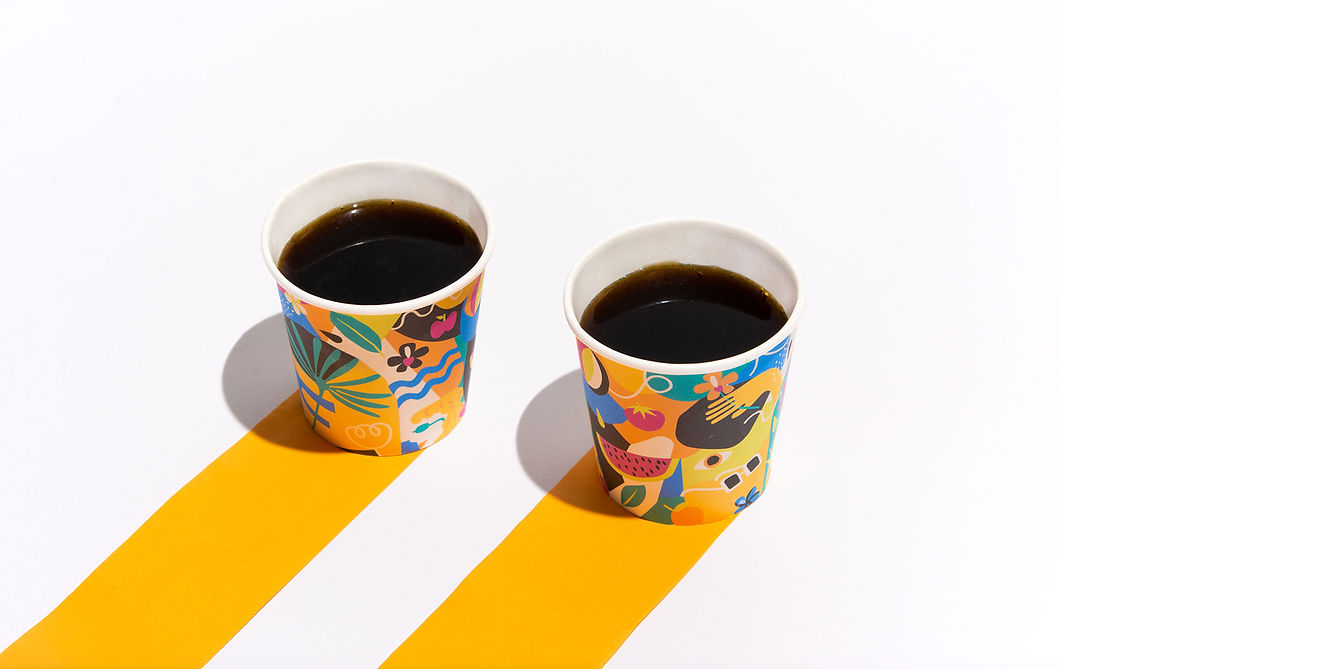
Collages I

VIVO WELLNESS BAR
JUICE BAR
Branding & Art Direction:
Delia Albarrán
Illustrations:
Delia Albarrán
Mariela Mezquita
Photography:
Delia Albarrán
Mariela Mezquita
Animations:
Felipe Degetau
Vivo Wellness Bar is a juice bar located in Cuernavaca, Mexico — a city also known as "The City of Eternal Spring." The juice bar offers a variety of products made with natural, healthy ingredients. The branding aimed to reflect a fresh and playful spirit through colorful and cheerful illustrations, while also paying homage to the place where the brand was born. The name “Vivo” means “I live” in Spanish. We playfully use the two “v”s to suggest a vibrant, organic structure, while the “o” evokes the fruity and fresh ingredients found in the products.